QR Code Color Palettes: 15 Combinations That Work Perfectly
Print vs screen vs outdoor, minimum sizes, grayscale and phone testing, pastel brand workarounds, and fifteen high-contrast QR color pairs with per-palette print notes, plus Pretty QR steps.


QR Code Color Palettes: 15 Combinations That Work Perfectly
A plain black-on-white QR code works. On-brand codes (recognizable colors, sometimes with a logo) often get more scans than generic ones: marketing benchmarks and platform-reported studies commonly land around 30–50% higher engagement, because people trust what looks familiar more than a mystery grid. Color only pays off if you still respect contrast; this article is the practical half of that tradeoff.
Short answer: pair dark modules with a light background, keep luminance contrast high (about 4.5:1 or better as a rule of thumb), and test on phones before you print. The fifteen hex pairs below are starting points I reach for when I want brand-appropriate color without gambling on scan reliability.
I once shipped a flyer where the QR looked fine on my laptop and died under conference hall lighting: too little separation between two blues. If you are new to the basics, read getting started with custom QR codes first; for quiet zones and print discipline, see QR design best practices.
How should you route this: print, screen, or outdoor?
Use this as a decision fork before you pick a palette:
- Mostly printed (business card, menu, packaging, event flyer) → treat ~4.5:1 contrast as your floor, use the size table in the next section, and proof on real paper (coated vs uncoated changes perceived contrast).
- Mostly on screen (email footer, slide deck, social graphic) → same contrast logic applies; ambient light varies less than print, but people still scan phone screens in sunlight. Do not rely on “it looked fine on my monitor.”
- Outdoor, backlit, or long viewing distance → push contrast higher (think 7:1 when you can), increase physical size, and avoid busy or strongly tinted backgrounds behind the symbol.
What physical size should the QR be on the final piece?
Small codes punish stylish color faster than boring black-on-white. When you are between sizes, go larger.
| Where it lives | Approx. minimum width | Notes |
|---|---|---|
| Business card | 0.8 in (2 cm) | Prefer 1 in+ if the pair is trendy or the stock is uncoated |
| Flyer / brochure | 1 in (2.5 cm) | Restaurant table tents and handouts: add margin if lighting is warm or dim |
| Poster (viewer ~3 ft away) | 2 in (5 cm) | Step back and scan; weak pairs need more real estate |
| Banner / sign (~6 ft) | 4 in (10 cm) | Sun and backlight eat contrast; bump size and contrast |
Rule of thumb: minimum width ≈ viewing distance ÷ 10 (a code read from 10 ft wants about 1 ft wide; when in doubt, round up). Colored modules are not a license to shrink.
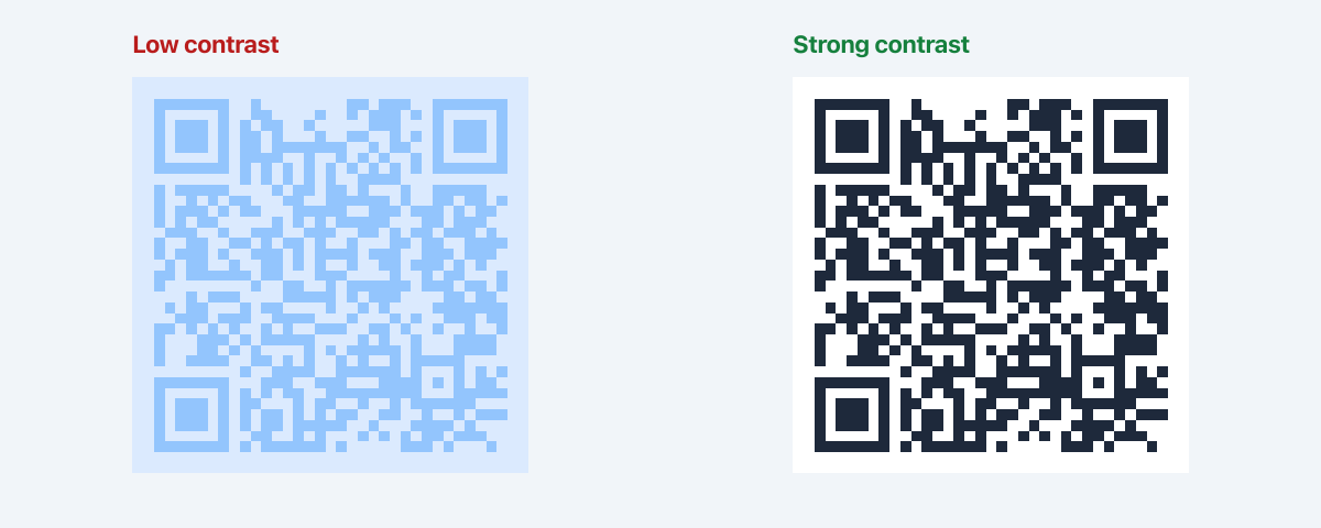
Why do dark modules on light backgrounds scan more reliably?
Phone cameras meter exposure on the whole frame. A dark pattern on a light field gives the detector crisp edges; light gray on off-white can look artsy and scan as mush. ISO defines the QR symbol structure, but real-world lighting is what decides whether a read succeeds, so favor high separation over subtle tints.
What contrast ratio should you aim for?
For text, WCAG often cites 4.5:1 for normal copy. QR modules are not text, but that number is still a useful lower bound: if your pair passes a standard checker at 4.5:1 or better, you are usually in good shape. Below ~3:1, assume outdoor or dim-room failure until you prove otherwise with devices you care about.
Use a checker such as the WebAIM Contrast Checker on your foreground vs background hex values (sample the module color against the quiet zone color, not a gradient mid-tone).
What if my brand colors are light, pastel, or mostly yellow?
This is the question I see most from designers and small-business owners: “Our palette is soft pink / butter yellow / mint: how do we still look on-brand?” Scanners do not care about your mood board; they care about luminance. Light modules on a light field fail in dim light and on older cameras, full stop.
Rules of thumb:
- Put your darkest brand swatch on the modules (foreground). If nothing in the guide is dark enough, use navy or charcoal for the grid and keep “brand” in the background tint, frame, or layout around the code.
- Use a light brand color as the background (the quiet zone and field behind the modules). That is often how you get pastel in the piece without sacrificing reads.
- Reserve accent colors for the logo or decorative frame, not for painting low-contrast data modules. The logo tutorial is the right place to stack brand marks once the base pair is safe.
| Your palette | What to do |
|---|---|
| Mostly light / pastel | Dark modules (darkest swatch or neutral); pastels on background or outside the code |
| One dark + one light | Dark = modules, light = background |
| All mid-tones | Darken the module color until it clears ~4.5:1 on the checker. Do not ship “almost.” |
| You want pastel on pastel | Use a white or cream card behind a high-contrast code; carry pastel in the frame, page design, or logo instead |
Yellow deserves a special callout: yellow modules on white are a frequent failure mode because the value gap collapses. If yellow is sacred to the brand, keep yellow in the surrounding design and use a dark foreground for the QR itself.
Which professional and corporate palettes work well?

Print note: These three usually hold from about 1 in (2.5 cm) on coated stock. On uncoated, cream, or kraft, favor Navy & Cream or Charcoal & Pearl; Forest & Sage loses edge faster when the paper itself pulls yellow-green.
Professional & Corporate
1. Classic Navy & Cream
- Foreground:
#1a365d(Navy Blue) - Background:
#f7fafc(Cream White) - Best for: Corporate documents, business cards, professional materials
- Why it works: Survives office fluorescent and slightly warm paper better than gray-on-gray; reads corporate without harsh pure black.
2. Charcoal & Pearl
- Foreground:
#2d3748(Charcoal Gray) - Background:
#f7fafc(Pearl White) - Best for: Minimalist brands, luxury products, clean layouts
- Why it works: On glossy cards, pure black can crush fine module detail; charcoal keeps separation while feeling premium.
3. Forest & Sage
- Foreground:
#276749(Forest Green) - Background:
#f0fff4(Sage White) - Best for: Sustainable brands, outdoor companies, health products
- Why it works: Strong eco story; keep the quiet zone clean and avoid yellowed stock. Green modules need a truly light field to stay crisp at small sizes.
Which bold, energetic palettes work well?

Print note: Great on screens and large print. For small pieces under warm LED (bars, retail), Electric Blue & Ice is the riskiest of the three (see the close call under mistakes). Crimson & Blush and Royal Purple tend to tolerate mixed lighting better if size is tight.
Bold & Energetic
4. Electric Blue & Ice
- Foreground:
#2b6cb0(Electric Blue) - Background:
#ebf8ff(Ice Blue) - Best for: Tech companies, innovation brands, digital products
- Why it works: Coordinated blue family for UI and slides; modules stay darker than the ice field on a calibrated display. Verify under tungsten or warm LED before small-format print.
5. Crimson & Blush
- Foreground:
#c53030(Crimson Red) - Background:
#fed7d7(Blush Pink) - Best for: Food brands, urgent CTAs, high-attention campaigns
- Why it works: Strong separation for sale stickers, packaging, and retail lighting where you need pop without red-on-red mush.
6. Royal Purple & Lavender
- Foreground:
#553c9a(Royal Purple) - Background:
#f7fafc(Lavender White) - Best for: Creative agencies, beauty brands, premium products
- Why it works: The background reads near-white to the camera, so this pair survives smaller print better than heavy pastel-on-pastel purples.
Which warm palettes suit food, retail, and hospitality?
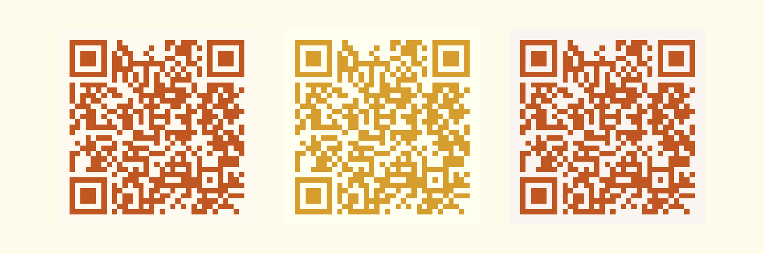
Print note: Food and hospitality often use warm bulbs. These pairs were chosen so orange and terracotta still read. Golden Yellow & Ivory is the outlier: treat it as flyer-sized or larger, or darken the foreground a notch for cards.
Warm & Inviting
7. Burnt Orange & Cream
- Foreground:
#c05621(Burnt Orange) - Background:
#fffaf0(Warm Cream) - Best for: Food service, autumn campaigns, cozy brands
- Why it works: Cream softens glare from overhead warm lights compared with stark white. Modules stay distinct on menus and table tents.
8. Golden Yellow & Ivory
- Foreground:
#d69e2e(Golden Yellow) - Background:
#fffff0(Ivory) - Best for: Optimistic campaigns, family-friendly brands
- Why it works: Yellow is inherently borderline for luminance; ivory buys separation. Use at ≥ ~1 in print or bump the hex darker if scans waver.
9. Terracotta & Sand
- Foreground:
#c05621(Terracotta) - Background:
#faf5f0(Sand) - Best for: Artisan brands, craft businesses, earthy products
- Why it works: The sand field hides slight paper color shift on kraft and natural stock while keeping modules clearly darker.
Which cool palettes suit wellness, finance, and calm brands?

Print note: Spas and clinics often run dim, warm lighting. Teal & Mint is the one to field-test in the actual room. Slate & Cloud is the safest “boring wins” pair for specs and RFPs. Indigo & Sky fits trust contexts at flyer size and up.
Cool & Calm
10. Teal & Mint
- Foreground:
#2c7a7b(Deep Teal) - Background:
#f0fdfa(Mint White) - Best for: Wellness brands, spas, calming products
- Why it works: On-brand for calm verticals; if ambient light is warm and low, darken teal one step or size up. Mint fields go muddy fast when the room does.
11. Slate & Cloud
- Foreground:
#4a5568(Slate Gray) - Background:
#f7fafc(Cloud White) - Best for: Architecture, design firms, professional services
- Why it works: B&W photocopy and cheap office prints tolerate gray modules better than saturated hues. Good for contracts and leave-behinds.
12. Indigo & Sky
- Foreground:
#3c366b(Indigo) - Background:
#ebf4ff(Sky Blue) - Best for: Finance, consulting, trust-heavy services
- Why it works: Reads serious on screen and paper; the sky wash stays light enough for dense module grids at moderate print sizes.
Which seasonal palettes work for short campaigns?
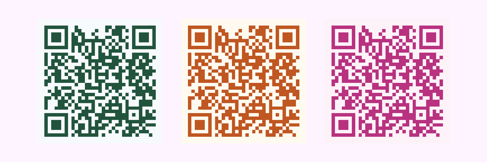
Print note: Seasonal pieces are often short runs; you can still proof on desktop inkjet. For window clings or outdoor boards, Pumpkin & Harvest may need one size step up in sun; Valentine Pink should stay ≥ ~1 in so pink modules do not mush.
Seasonal & Special
13. Holly Green & Snow
- Foreground:
#22543d(Holly Green) - Background:
#f7fafc(Snow White) - Best for: Holiday campaigns, winter promotions
- Why it works: Festive without sacrificing dark-on-light; skip it if the sheet is cool blue-white and fights your perception of “snow.” Test on the actual card stock.
14. Pumpkin & Harvest
- Foreground:
#c05621(Pumpkin Orange) - Background:
#fffaf0(Harvest Cream) - Best for: Fall campaigns, harvest festivals
- Why it works: Warm seasonal read; bright sun can wash the cream field. Size up for sidewalk signs and storefront posters.
15. Valentine Pink & Rose
- Foreground:
#b83280(Valentine Pink) - Background:
#fdf2f8(Rose White) - Best for: Romance-themed products, beauty, limited events
- Why it works: On-brand for beauty and gifting; keep physical print generous. Pink modules need room and a clean quiet zone to stay distinct from the rose field.
How do you choose the right palette for your brand?
Start from brand colors when you can: match the module color to a primary or secondary from your guidelines and pick a background that clears the contrast checker. If the guide is all pastels or lights, use the table in What if my brand colors are light, pastel, or mostly yellow? before you force a weak pair. If your brand is dark-on-dark, invert for the QR (light card behind the code) instead of forcing low contrast on the asset itself.
Match the medium: gloss paper, matte laminate, and outdoor sun all change perceived contrast. When in doubt, bump contrast one step for print. Tie physical size to the size table above. Stylish pairs are not an excuse to shrink. If you add a logo, see how to add your logo to a QR code; oversized marks are a separate failure mode from color.
What mistakes break QR code colors?
Close call (real pair from this list): Electric Blue & Ice looked perfect on my laptop, then struggled on a table tent under warm LED: the blue modules sank toward the ice background. I fixed it by darkening the foreground a couple of steps or switching to a whiter background. If you love that pairing, test in the actual venue lighting and size up before you commit print.
Scanning killers
- Light modules on light backgrounds
- Same-hue stacking (blue modules on a blue-tinted field without enough value gap)
- Neon colors that bloom on camera sensors
- Gradients inside the data modules
- Code too small for the contrast you chose (see the size table)
Design traps
- Too many colors in one symbol
- Ignoring brand accessibility rules
- Seasonal colors on permanent signage that will look dated
- International campaigns: red often reads as celebration or luck in many East Asian contexts but as error or urgency in Western product UI; green is not universally “go.” Use symbolism that matches your audience, then still run contrast and device tests. Culture does not fix low luminance separation.
How do you apply these hex codes in Pretty QR?
- Open /design (or start from the homepage and move into the editor). After your first edit, Pretty QR keeps your work on
/design/[id]so colors survive refresh, same flow as in the logo tutorial. - Set content first (URL, text, Wi‑Fi, etc.), then optional templates for a quick base style.
- In the Styling tab, paste foreground and background hex values, or use the color pickers, and watch the live preview.
- Download PNG, JPG, or SVG and run your phone scan test before high-volume print.
How should you test colors before you print?
Grayscale sanity check: Scanners effectively care about luminance. Take a screenshot of your code and desaturate it (macOS Preview: adjust saturation to zero; Photoshop: Image → Mode → Grayscale; Figma: layer grayscale or a plugin). If modules disappear into the background in black and white, fix contrast before you pay for plates or a long print run.
Five-second rule: if a colleague cannot scan it in a few seconds under normal office light, tighten contrast or size before you commit budget to print.
Device mix: try iPhone and Android, ideally one older handset; different cameras expose differently.
Distance: step back to the distance someone will stand in the real environment; small codes punish weak contrast faster.
On real stock: inkjet proof on the same paper family you will use; uncoated and kraft steal contrast compared with glossy comps.
How can monochromatic, complementary, and analogous schemes help?
Monochromatic: dark shade of your brand hue on a very light tint of the same hue. Cohesive and usually safe if value separation is wide.
Complementary: opposites on the color wheel can maximize pop; just verify the checker. Vivid pairs can still fail if mid-tones creep together.
Analogous: neighbors on the wheel feel harmonious; keep the modules darkest in the group so the pattern does not disappear into the background.
What do common module colors signal?
Loose associations only. Category norms change by industry and region. Pair this list with contrast testing, not wishful thinking:
- Blue: trust, finance, tech
- Green: growth, health, sustainability
- Orange: urgency, food, energy
- Purple: premium, creative
- Red: attention. Use when you want the code to shout, not whisper.
The best palette is the one that matches your brand, passes a contrast check, and survives a real scan on hardware your audience actually uses. When you are ready to iterate quickly, open the design editor, pick a template from the gallery, and treat these fifteen pairs as copy-paste starting points, not a substitute for testing.
Questions? [email protected]
Frequently asked questions
What is a safe color combination for a QR code?
Use dark modules on a light background and aim for strong luminance contrast between the two. A practical target is at least about 4.5:1 between foreground and background (check with a contrast tool). Very light-on-light or same-hue pairings often fail in dim light or on older phones.
Can QR codes be colored, or do they have to be black and white?
They can be colored. Black on white is the most forgiving default. If your brand is mostly pastels or light yellows, use a dark neutral (navy, charcoal) for the modules and keep brand color in the background tint, frame, or logo, not in low-contrast module paint. Avoid gradients in the modules, neon glare, and busy patterns; verify on real phones.
What contrast ratio should I use for QR code colors?
Treat roughly 4.5:1 as a good minimum for reliability in normal conditions. Below about 3:1 is risky. WCAG-style contrast checkers (for example WebAIM) are a useful sanity check even though QR scanning is not identical to text accessibility.
How do I set custom QR colors in Pretty QR?
Open the design editor at /design, pick your content and optional template, then use the Styling tab to set foreground and background colors, then paste the hex values from this article or choose from the picker. Work is saved on the persisted /design/[id] URL after your first change.
Why do my colored QR codes fail to scan?
Usually the module and background are too similar, the code is too small for the lighting, or a logo/frame is eating the quiet zone. Fix contrast first, re-test at arm length, then adjust size or logo coverage. Our design best practices post covers quiet zones and print testing in more detail.
What is the grayscale test for a QR code?
Desaturate a screenshot of your code (set saturation to zero in any editor, or convert to grayscale). If modules blend into the background in black and white, scanners will struggle too. Increase luminance contrast between foreground and background, then retest on a phone.
How big should a printed QR code be?
Rough minimums: about 0.8 in (2 cm) on a business card, 1 in (2.5 cm) on a flyer, 2 in (5 cm) on a poster viewed from ~3 ft, 4 in (10 cm) on a banner from ~6 ft. Colored or stylish pairs need more margin; size up if scans feel finicky. Rule of thumb: minimum width ≈ viewing distance ÷ 10.
Related articles
How to Add Your Logo to a QR Code (Step-by-Step)
Upload your brand mark in Pretty QR’s Logo tab: file limits, size and margin sliders, hide-background-dots, testing, and export as PNG, JPG, or SVG—without breaking scans.

Getting Started with Custom QR Codes
Learn how to create beautiful, customized QR codes that stand out from the crowd and actually get scanned.

5 Design Tips for Scannable QR Codes
Essential design principles to ensure your beautiful QR codes actually work when people try to scan them.